Branding +DIGITAL+PRINT
Projects
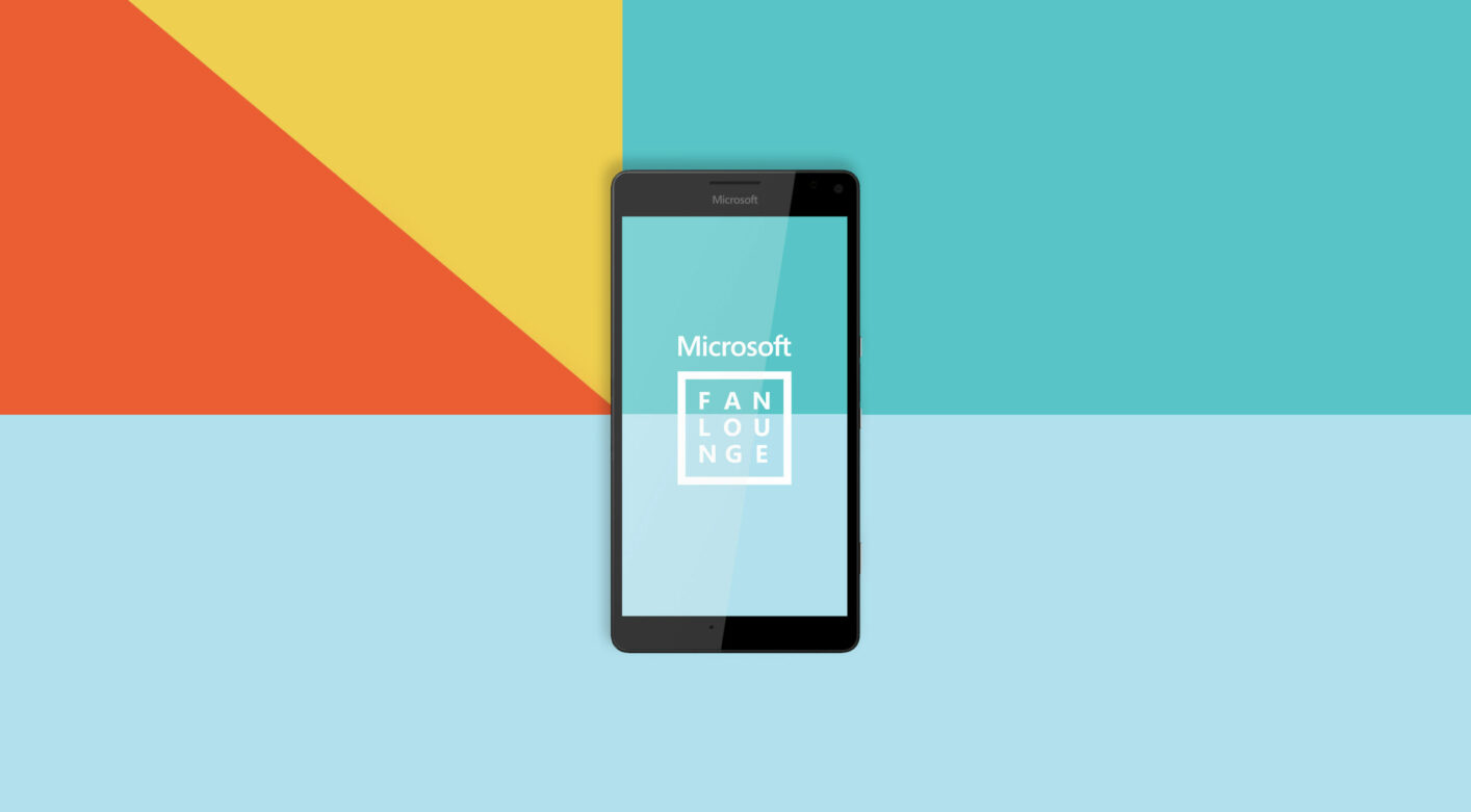
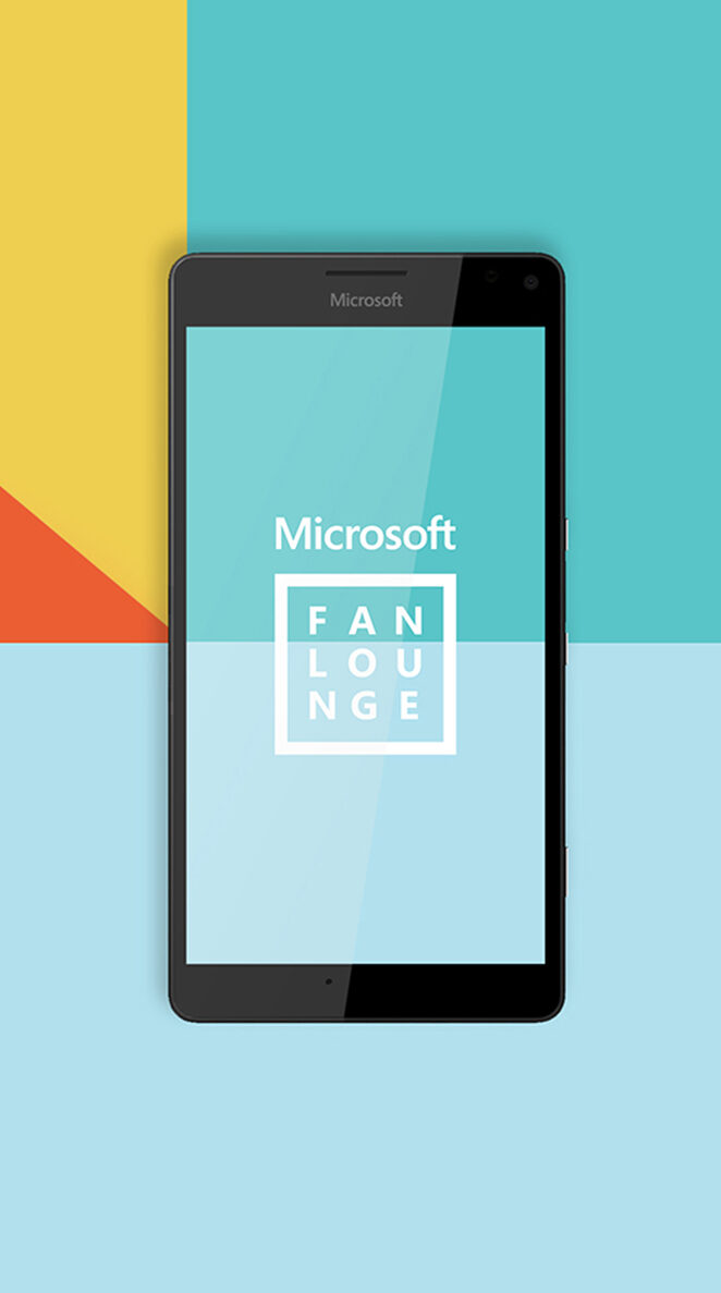
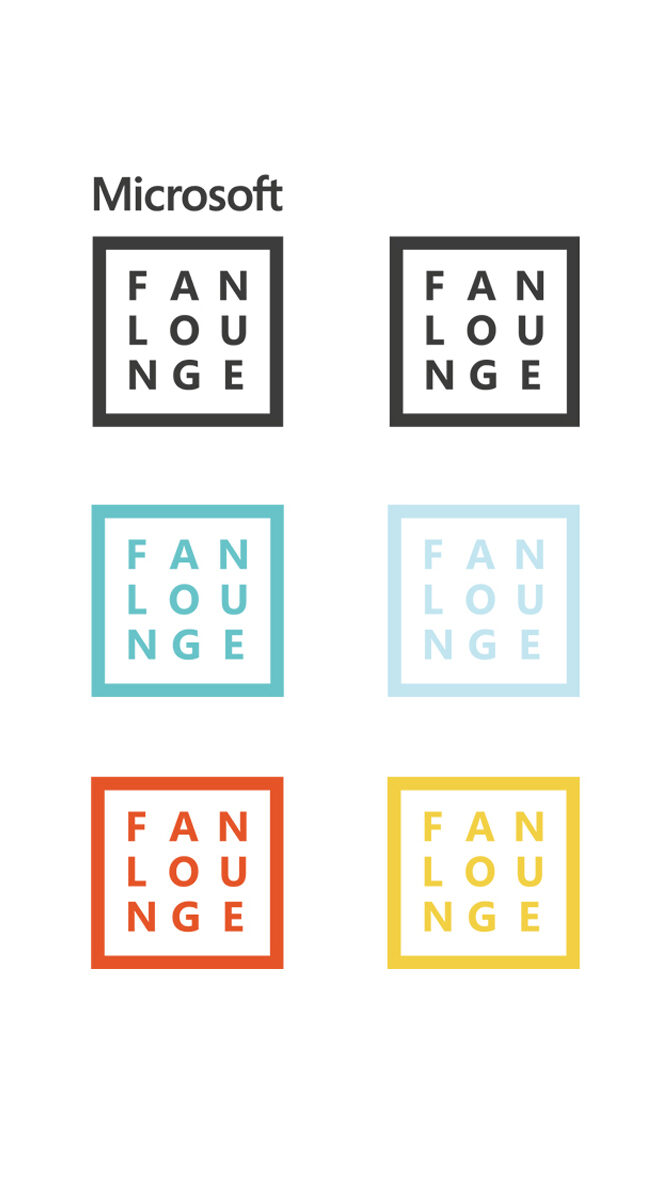
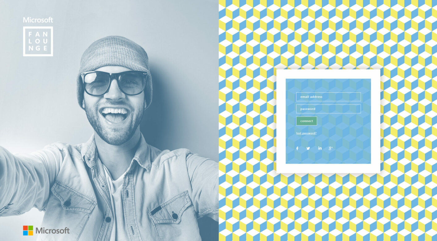
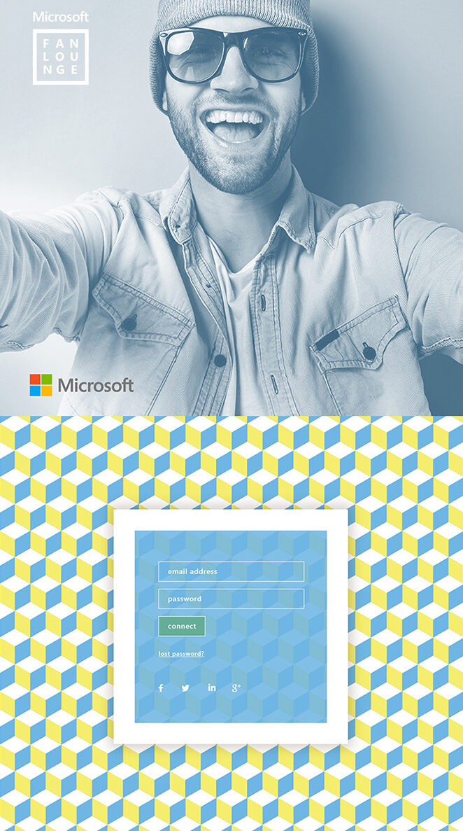
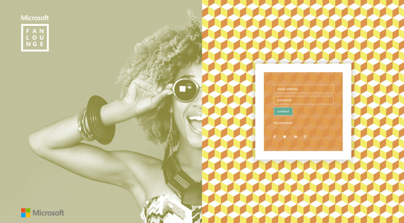
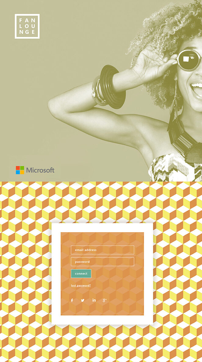
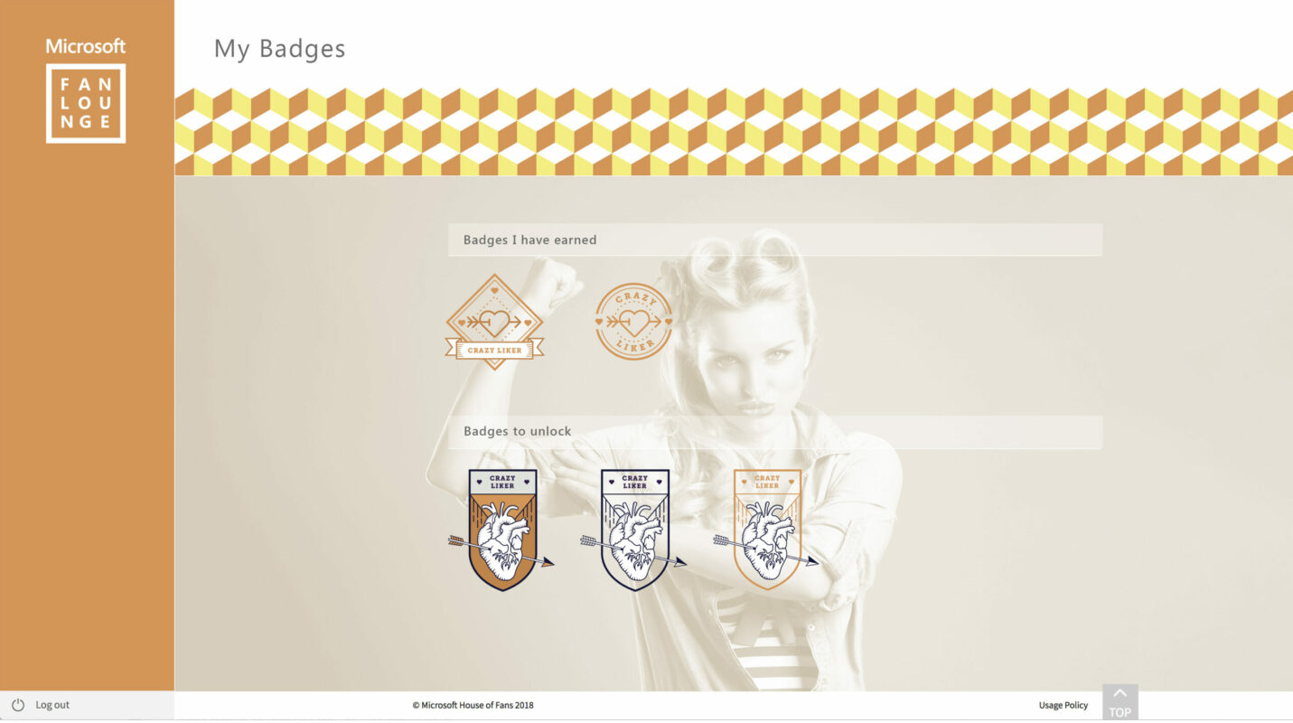
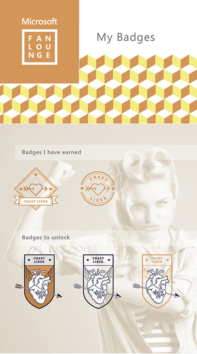
Microsoft fan lounge
branding
Sector
Media
Deliverables
Logo
Location
London
Year
2017
Microsoft fan lounge
branding
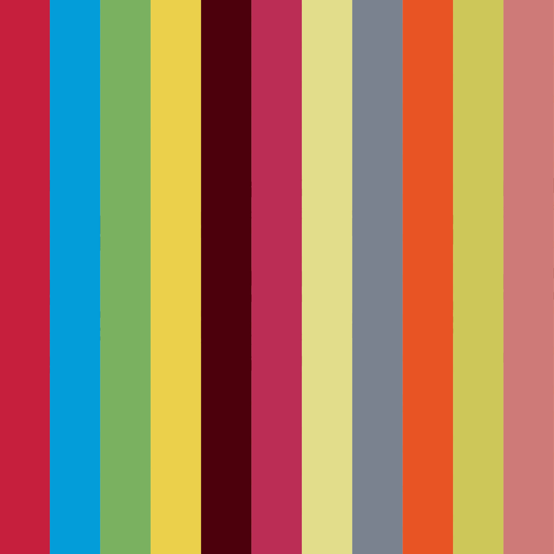
Rebrand of the Microsoft Fan Lounge. The inspiration behind this logo was to take one of the Microsoft squares from the existing Microsoft logo, and make reference to it here for synergy. The words ‘Fan Lounge’ feature inside the square is to give the idea of a community. The colour palette is premium, fun and cool. It’s modern and gender inclusive too. The vibrancy comes from having two warm colours and two cold colours which compliment each other. The colours emphasise the social and approachable nature of a fan zone. It will make the platform feel like a happy place.